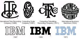
 IBM logo is a distinctive statement of depicting company’s promise of commitment to its principles and fosters immediate recognition all across the world. Over the years, IBM logo has been perceived as an image of expertise, innovation, service and trust, thereby reinforcing the strength of IBM in the industry.
The IBM logo story began in 1924 when the Computing-Tabulating-Recording Company was renamed as International Business Machines. As part of the re-branding exercise, the ornated letters that formed the “CTR” logo was replaced by the words “Business Machines” in more contemporary sans-sarif type, and in a form intended to suggest a globe, girdled by the word “International.” In line with company’s global expansion mode a new global shape logo was born girded by the word “International.”
To help carry its transition from punch-card tabulating business to computers, in 1947, the “globe” was replaced by simplistic “IBM” in a Beton Bold font. In 1956, Paul Rand conceptualized first IBM continuity logo in solid black letters with City Medium type font. The idea was to make the logo look more solid, grounded and balanced. The celebrated graphic designer again had redone the logo in 1972 with horizontal stripes to suggest more speed and dynamism.

